Monday, August 23, 2010

Check, Please!


This week's architecture collage features a hodge podge of patterns that seem to work. I started with this exterior image of a stone building in Europe. I complimented this with a brick pattern and used a check printed gift bag to balance it. A green scrap from a previous project unifies it all.

Monday, August 16, 2010

Beach Glass Cuff Bracelet

I am taking a break from blogging about my collage challenge to show you my latest creation: a beach glass cuff bracelet.


Over the weekend a longtime friend - and fellow jewelry enthusiast was visiting - so I signed us up for a class at a local bead store to make this bracelet. We had a blast and in less than hour we each had one of these lovely cuff bracelets.


Made from aluminum, the bracelet is super light and very stylish!

Thursday, August 12, 2010

Paris in the Summer

Continuing with my architecture theme this month, I thought it'd be fun to use this image of the Eiffel Tower. I've have the image for awhile and never knew what to do with it until today.

After looking at several different color schemes for my latest sketchbook collage, I settled on this cheery yellow. It's a nice compliment to the tower. It makes me long for summer in Paris, how about you??

Thursday, August 5, 2010

And the theme of the month is...architecture

I really didn't have a theme for this month until, well this morning. I realize the month is already 5 days old, but I felt I needed to see what available images I had before I made my decision.

I settled on the theme of architecture for this month's collage challenge. Since the days when I worked in 2 architecture museums, I've been interested in building structures.

This collage reflects that. I chose an image of a European-looking building as my focal point. I then selected this bright blue sheet of paper and complemented it with some rough textured natural paper. Stay tuned for more architecture inspirations as the month goes on!

Thursday, July 29, 2010

The Question

This is the last in my series of red collages for the month of July.

I like how this one turned out, because I had been struggling with the composition. It wasn't until I decided to shift everything just so, that it all turned out. Don't you love happy accidents?

Next month, stayed tuned for a new theme...

Thursday, July 15, 2010

Red Hearts

My latest collage in red was quite a challenge. But not for the reasons you may assume.

Instead, it was simply that I have so few scraps of red and they are all pretty much the same shade of red. Then I realized that most shades of red are the same, because it they were any lighter then they would be pink or orange!

So, I had a brilliant idea to break up all the reds so the collage didn't appear, well monochromatic. I took a piece of tissue paper and glued it to the top of my all-red collage composition. Then I used a gel medium to adhere it so that it became transparent in spots. I must say that I am pleased with the result and think this may be favorite red collage so far!

Thursday, July 8, 2010

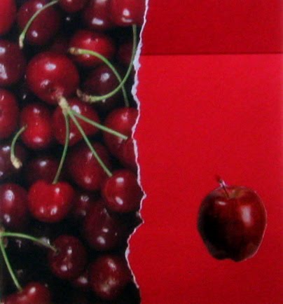
Cherry Red


This is my latest "red" collage. I combined 2 different shades of red paper and separated them with a torn piece of cherry printed paper. I thought the apple was a nice touch that added a visual contrast to the piece.

On a side note, is it me or is red one of the most difficult colors to capture digitally?

Thursday, July 1, 2010

Red Hot

It’s the six month mark for my collage challenge. I am half way done and still have a half a year to go. This month, instead of just showing you the collage I created, I am also going to give you a glimpse into my creative ideas for the rest of the month.

I bet you can guess from the title what this month’s theme is. If you said, “the color red,” then good for you! You got it right. For the rest of the month, I’ll be focusing on all things red.


But first, I had to go through all of my scraps and images to collect everything and anything that contained a shade of red. Then, I assembled them all together to get a feel for the color palate.


For this first collage, I was really drawn to the scraps that I had used a punch on, because I liked the way they could overlap but also show some white space. Then I put the image of the phone in, and more punched out scraps. It didn’t seem completely finished, so I added the ladybugs as an after thought and am pleased how it all turned out. What do you think??